
Sleepy Bear
Packaging that brings a world of better health to life
PACKAGING DESIGN | ILLUSTRATION
Challenge
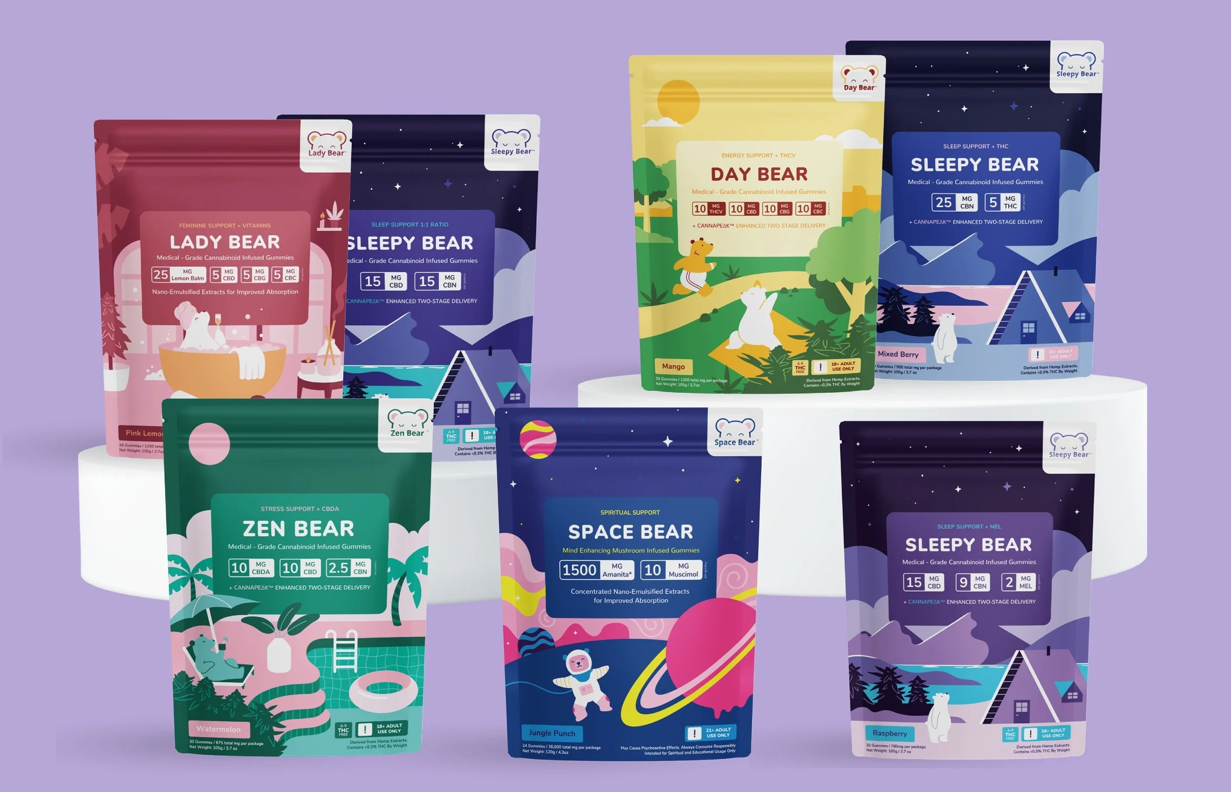
Sleepy Bear is a gummy brand that focus on using research to bring high quality THC products to more people, especially with chronic conditions. The company was created when Kyle was medically discharged from his position as an army ranger and started looking for ways to manage his pain. With so many people struggling with sleep, low energy or life stages like menopause, Sleepy Bear wanted their packaging to clearly show their different options while also sharing their positive and supportive


Solution
Since Sleepy Bear put so much focus on their research and pairing the best ingredients like Melanin with their THC products, we wanted to create illustrations that help customers find the product that best fits their unique needs. By sticking to a simple colour scheme, we were able to create colourful designs with the bear character that still felt professional and playful in the right proportions.
Each products had a unique concept that reflected both the ingredients and the flavour of the gummy.


Process
We started by creating the bear character since we wanted to make sure we strike the right balance between looking cute while not looking too young. Once the bear character was refined, we started creating layouts and concept sketches for each design. By refining and playing with the layout, the illustrations could take centre stage without disrupting the content.


Impact
A relatable brand
Sleepy Bear found that many of their customers saw themselves in the bear “that looks just like I feel when I use Sleepy Bear” which helped build brand loyalty.
Easier marketing
The illustrated backgrounds and mockups helped created a marketing kit with lots of personality
A clear direction
From colours specific to each product to illustrations and layout, the new designs helped solidify the brand overall.

Ready for a brand you feel proud to share?
Get in touch and let us know a little bit about your project!